Life
How Many People Are On The Internet In The World?

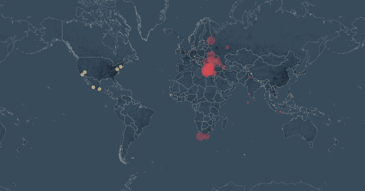
Do you ever just sit around wondering how many people around the world are doing the same thing you are? I do this a lot, especially when I'm stuck in traffic: Like, how many other people in the world are sitting miserably in a car as George Ezra croons in the background? It may be tough to measure how many people exactly are sitting in traffic at any given time, but it turns out it's actually possible to measure how many people are on the Internet at any given time. This map is proof, and it's very cool.
Ralph Straumann and Mark Graham of the Oxford Internet Institute developed the map, although it isn't really a map in the traditional sense at all. It's what's called a "hexagonal catrogram," which means that the countries themselves are built out of hexagrams (each tiny hexagram represents 470,000 online individuals), and distorted to reflect the date they're supposed to represent. Basically, countries can appear disproportionately larger or smaller than they actually are on the map if they use a lot (or very little) Internet.
The map was developed using 2013 data from the World Bank, and there are some really interesting insights from it. Did you know, for example, that 46 percent of Internet users in the world are in Asia? Or that despite the fact that most people in China have never used the Internet, there are still more Internet users in China alone than there are in the U.S., India, and Japan combined? True story — and the proof is in the map below:

qaFollow Straumann on Twitter @rastrau and Graham @geoplace — and if you liked this map, then check out these five other cool maps of neat-o things from around the Web:
1. All Our Suns Map
This map is a visual representation of all the photos being tagged #sunrise or #sunset on Instagram around the world in real time.
2. London's Oyster Card Tap-Ins
Oliver O'Brien, a geography research at University College London, created this map to show the tidal flow of people tapping into the London Underground system on a given week day.
3. Foursquare Check-Ins In New York and Tokyo
This map represents a year's worth of check-ins in New York and Tokyo, and it's totally mesmerizing.
4. The Most Expensive Paintings Sold Around the World
These maps shows you the most expensive paintings sold in each European country.
5. Traffic of Long-Distance Freight Trains in Spain
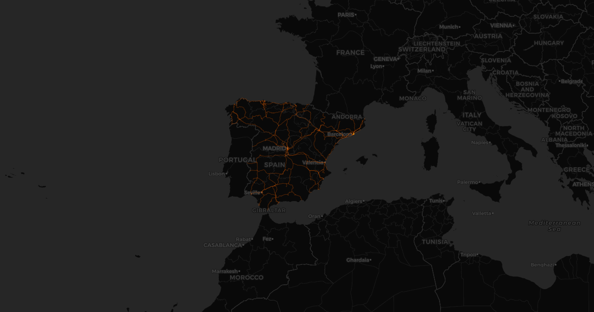
The paths of long-distance freight trains in Spain may not be something you necessarily knew you wanted to know about, but it's really cool nonetheless.
Images: Tanel Teemusk/Flickr; Courtesy of Ralph Straumann and Mark Graham, Geonet; All Our Yesterdays
