News
Why Is Google's New Logo Sans Serif?

On Tuesday, corporate giant Google unveiled a new logo, which marks the first major amendment to the classic serif icon since 1999. Get used to it: You'll be seeing "New Google" everywhere, from the California Googleplex to your search engine bar to your cell phone apps. Part of the major change is that, as Fast Company reports, Google's new logo font is sans serif. Literally translated to "without serifs," it's a younger, more sharply emphasized typeface.
Let's slow down a second: what on earth are "serifs"? Well, if you look closely at Google's old font, or typefaces like Courier, you'll see the tiny strokes at the borders of each letter: The bar at the base of a capital A, the little tail on the right side of a little "g." They're thought to be easier to read, and for that reason "sans serif" — physically missing those little strokes — are more often used for emphasis, like for quotes or in headlines of magazine articles. It's a younger and softer, especially in the rainbow tones of Google logos past and present.
"We think we’ve taken the best of Google (simple, uncluttered, colorful, friendly), and recast it not just for the Google of today, but for the Google of the future. You'll see the new design roll out across our products soon. Hope you enjoy it!" Google wrote on its blog.
Here's the old logo. Note the little serifs at the right side of the Gs, both big and little, and at the top of the "l."
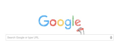
And here's the newbie...
The "g" icon is gone, too, replaced with a rainbow "G" — which is also sans serif.
Google designers Alex Cook, Jonathan Lee, and Jonathan Jarvis explained the serif changes on the Google Design blog.
The Google logo has always had a simple, friendly, and approachable style. We wanted to retain these qualities by combining the mathematical purity of geometric forms with the childlike simplicity of schoolbook letter printing. Our new logotype is set in a custom, geometric sans-serif typeface and maintains the multi-colored playfulness and rotated 'e' of our previous mark—a reminder that we'll always be a bit unconventional.
The new logo will look better on different devices, they added.
The old logo, with its intricate serifs and larger file size, required that we serve a text-based approximation of the logo for low bandwidth connections. The new logo's reduced file size avoids this workaround and the consistency has tremendous impact when you consider our goal of making Google more accessible and useful to users around the world, including the next billion.
Of course, many people had mixed feelings about the stark lack of serifs.
Google also released a video Tuesday morning to help explain the change.
Images: Google Blog