Fashion
Pantone Chose 2 Colors This Year For A Good Reason
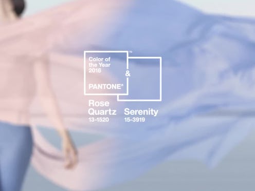
Each year, the color experts at Pantone choose a single it hue that dictates upcoming trends in everything from fashion design to home décor. This year, though, they are shaking up the routine a little bit. Pantone has chosen two colors for 2016 — Rose Quartz and Serenity — instead of just one. So, why has the company opted for two shades this year instead of the usual one? The answer might have to do with gender.
Rose Quartz, a soft pastel pink, and Serenity, a pale powder blue, are colors typically associated with babies — blue for boys, and pink for girls. Pantone has chosen this particular color duo to challenge "traditional perceptions about color association," according to a press release.
Leatrice Eiseman, executive director of the Pantone Color Institute, further explained, "In many parts of the world we are experiencing a gender blur as it relates to fashion, which has in turn impacted color trends throughout all other areas of design,” ABC News reports. She adds, “This more unilateral approach to color is coinciding with societal movements toward gender equality and fluidity, the consumers’ increased comfort with using color as a form of expression which includes a generation that has less concern about being typecast or judged, and an open exchange of digital information that has opened our eyes to different approaches to color usage.”

The baby pink and blue shades are meant to “inducing feelings of stability, constancy, comfort and relaxation,” according to The Wall Street Journal. The delicate vibes of the colors definitely emanate a sense of peaceful calm, and the fashion industry seems to agree. Designers like Carolina Herrera have already put the colors to use. Her Spring 2016 collection was almost entirely comprised of this blush rosy shade.

I am always in favor of fashion looks that center around a social message. Tackling gender stereotypes with baby blue and pink may be a bit cliché, but at least it's a step in the right direction.
Want more beauty tips? Check out the video below, and be sure to subscribe to Bustle’s YouTube page for more hacks and tricks!
Images: Pantone (2)
