News
The 2016 Olympic Logo Was Inspired By Mountains
The last 90 years of Olympic logos have been a mix of beautiful, ugly, and confusing. Back in the '20s, the Paris logo looked more like a staid European coat of arms than an inspiring symbol meant to unite athletes from around the world. Then there's the awkward symbol for 1936 "Nazi" Olympics that occurred in Berlin during the time of Adolf Hitler. The Imperial Eagle holds the Olympic rings instead of a swastika, but it's still too close for comfort. Things progressed through the 20th century, perhaps culminating with Sydney's turn-of-the-century logo. Now with Rio de Janeiro we see a beautiful new logo, but what does it mean?
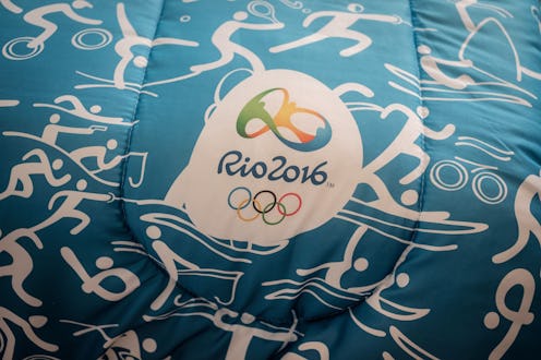
The bright and post-modern design is distinct from the other recent symbols, and a break from the hideous 2014 Sochi logo — thank God! This year's is bright and cheery, just like the Carioca people, as Rio's citizens are affectionately called. It consists of three different human-like figures holding hands and looping together and through one another, and it is meant to reflect the diversity and beauty of Rio's people and nature. The creative agency, Tátil, which is based in Rio and developed the logo, spoke about the process of developing it.
Creative Review translated their thoughts into English. Here's how they channeled Rio and its inhabitants into an Olympics logo:
We were born from a mixture of ethnicities. We warmly embrace all ethnicities, faiths and generations. We share our sky, our ocean and our happiness with the world. This human warmth, which is part of the Carioca nature and the Olympic spirit, is shaped by the exuberant nature of a city that inspires us to live passionately and carefree, and loves to share and engage with others.
The three colors have meanings, too — one meaning from nature and one from the people. Yellow represents the sun and the people's warm nature. Blue symbolizes the sea and Carioca's easygoing ways. Green is for the forests and the hope these Brazilians have.
Then the figures were shaped taking into account the mountains of the city, including one of the best-known natural elements in Rio, the Pão de Açucar, or Sugarloaf Mountain. It's a very recognizable part of the city's skyline, much of which is natural. It is at the edge of the Guanabara Bay and the Atlantic Ocean. Creative director of Tátil, Frederico Gelli, said, "We are in the middle of sculpture city, we need to make a harmonizing logo. All of the curves of the logo shapes come from the mountains in Rio de Janeiro — not only the main one Sugarloaf Mountain, but all of the the mountains."
The resulting logo is among the prettiest of this century. Well done, Rio!
