Books
Why Women's Book Covers Are So... Girly
You’ve judged a book by its cover — its martini-adorned, plastered-pink cover — and you’re not the only one.
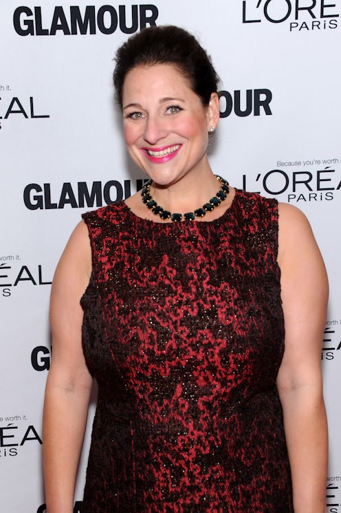
“Publishing has a gender problem,” Rebecca Mead, New Yorker staff writer and author of My Life in Middlemarch, said to an audience gathered to discuss the issues in women’s publishing, including packaging, marketing, and genre classification, at BookExpo America 2014. Mead moderated the Girl Books, Boy Books, Gender Hooks: Packaging, Positioning and Reviewing in the Fiction Marketplace panel, whose members included Deb Futter, Vice President, Editor-in-Chief, Grand Central Publishing; bestselling author Jennifer Weiner; Pamela Paul, Editor, New York Times Book Review; and Rachel Kahan, Executive Editor, William Morrow.
Fiction geared towards women can often be identified by its cover — and it’s no accident. Marketing departments at publishing houses make conscious decisions about targeting female consumers; after all, they are primary book buyers. But the repetition of certain motifs within covers leads to a consumer mindset in the marketplace that reinforces the divide between books for women and books for men.
Kahan told an anecdote of a friend who said, “I’ll mostly just read books whose covers are pink and lime green,” speaking to the marketing of commercial fiction towards women. “There has been this insidious creep of pastel colors, feet, legs, cocktail glasses ... It’s very stereotypical, and it telegraphs a message that this book isn’t very important,” Kahan added. “It says, ‘This is a book for a lady by a lady, and it’s a good time.”
Kahan said that if a book’s core audience is primarily women, you’re going to market to women — but the challenge is to avoid stereotypes. “After you've seen the 15th cover with legs on it, then you’ve started to hit a marketing problem.”
In short: Men generally won’t pick up books with covers adorned with stereotypically female motifs — and publishers are okay with that. That’s why Target, the major puppeteer in retail book sales, asked Weiner to change her cover for All Fall Down; originally, the book featured a primarily yellow street scene of Philadelphia that was according to the author “beautiful, painterly, and inviting — and not so gendered.”
Target asked for a rebrand of the image, which resulted in the blue-and-white rollercoaster — a metaphor for the struggle with addiction contained within the pages. She asked, “Do we really need our covers spoon fed to us like this?”
The panelists discussed Meg Wolitzer’s literary success The Interestings (2013), which had a gender-neutral cover — colorful stripes and text only — which was a crossover hit for both men and women.
Deliberate non-gendered marketing of the best-selling book worked so well that Penguin didn’t change the cover for its paperback edition to be more female-targeted — something that many titles, including a highly literary novel like Joyce Carol Oates’s I’ll Take You There — can’t escape.
“Women read everything. We’re taught to. But men have been trained to unless that cover explicitly says quality and not girliness, it’s not for me,” Weiner said. Weiner pointed to Donna Tartt’s Pulitzer Prize-winning The Goldfinch as a title that men haven’t hesitated to touch due to its positioning. “Some of [the discussion] has to be, let’s man up here. Just because there’s something on that cover that’s a cupcake or not just type … you, too, can read that book and be okay.”
“We have an obligation to sell books to writers, and we want to reach readers,” Futter said. She emphasized that she focuses on finding the right jacket for the book and juggling the obligation between consumers and authors. “I don’t know if we’ve found the balance yet,” she said.
Weiner countered. “At the end of the day, you don’t want to piss off Target.”
