News
Instagram Just Redesigned Their Logo & App
Watch out for a change on your home screen. Instagram just announced a new logo, both for its primary app and for other creative apps, including Layout, Boomerang, and Hyperlapse. The redesign extends to the app itself as well, including a "simpler design [which] puts more focus on your photos and videos without changing how you navigate the app," according to a post on the company's official blog Wednesday morning.
Writes Instagram:
Today we’re introducing a new look. You’ll see an updated icon and app design for Instagram. Inspired by the previous app icon, the new one represents a simpler camera and the rainbow lives on in gradient form.
You’ll also see updated icons for our other creative apps: Layout, Boomerang and Hyperlapse.
We’ve made improvements to how the Instagram app looks on the inside as well. The simpler design puts more focus on your photos and videos without changing how you navigate the app.
The Instagram community has evolved over the past five years from a place to share filtered photos to so much more — a global community of interests sharing more than 80 million photos and videos every day. Our updated look reflects how vibrant and diverse your storytelling has become.
Here's what the new logos look like:

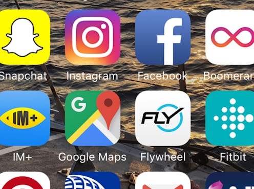
Here's how it will blend into your home screen:

And here's what happens when you open the app:

Instagram went on to explain those changes with a short video:
The team at Instagram reportedly worked for nine months before deciding on the new flat design logo, which is representative of the shift in technology since the app and its original logo debuted in 2007. "It’s a lot closer to the cameras that people use these days," Ian Spalter, Instagram’s head of design, told Co.Design. The care and consideration that went into the redesign is very apparent in this video published on Instagram's blog:
Inside the app, not much has perceptibly changed. The goal of the update was to make the user interface more native to the iOS and Android platforms. One of the few big changes is to the filter screens, which are now white instead of black. The shift might seem a little jarring, as photographs are typically viewed against a black backdrop to avoid other distracting light, but the new white background reflects the background against which your pictures will be seen on followers' feeds. The idea is to give users a better concept of what their picture will look like to others and the opportunity to step up their filter game even better.
The new logo might be the end of an era, but as smartphone photography continues to change and improve, Instagram is looking toward new possibilities for its platform and potential. The redesign reflects what's so great about Instagram: its ability to adapt to new technology and trends and to bring together people from all over the world.
