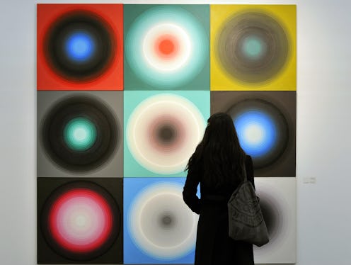
When researchers studied the science of color in the 60s and 70s, they found that red pills were more effective as stimulants and blue pills were more effective as sleeping pills...even when the alleged meds were just placebos. Their effects were purely the result of how our perception of color affects our minds and bodies, the Telegraph reports. Kind of puts a whole new spin on The Matrix, doesn’t it?
Although it’s still occasionally dismissed as “hippy-dippy,” research into the field of color perception has been steadily picking up in recent years. Beau Lotto, a neuroscientist at Unviersity College London, is one of the forerunners in the field. He demonstrates the impact of context on how we see and perceive color through optical illusions. Check out these illusions he’s created. Here, the center square on the top looks brown, while the center square on the side looks orange, right?
Check out what happens when you change the opacity of what’s surrounding those two squares:
Yep. They’re both brown. Neat-o, right? You can see it and other illusions in action at Lotto’s website; they're pretty rad, so check 'em out.
So what can we do with all this information, practically speaking? Lots. In marketing, for example, it can affect how consumers feel about a brand. “Colors and color combinations create moods and feelings, consciously and unconsciously,” Kate Smith, president and chief color expert at color consulting firm Sensational Color, recently told event planning site BizBash. “Whether we realize it or not, color affects us and our decision-making.” If you want to rev up people attending your event, use red as your color palette; if you want to calm them down, use blue. Even the color of your logo comes into play here; Fast Company created a whole bunch of infographics last month detailing how logo color affects the perception of a brand, and it’s a fascinating read. It makes sense that Nintendo’s logo would be red — exciting! Playtime! Video games! — while IKEA’s would be yellow and blue — mellow, cheerful, homey — doesn’t it?
Or consider home décor: According to Billings Gazette, there’s a reason shades of green, blue, and yellow often show up in spaces like kitchens and dining areas. They’re friendly, happy colors that encourage communication — just want you want in rooms where people tend to gather together to chat and share a meal.
I’d even go so far as to say that what color you wear on a first date might affect how your guy or gal perceives you. According to the swatches included with the Telegraph’s article, a pale pink or peach might be seen as feminine or soft, a bright, orange-based red as perky, and a blue-based red as sexy. If the clothes make the (wo)man, I’m sure color has a good deal to do with the resulting image; if I were playing the dating field right now, I might be tempted to test out the theory myself.
For more about this wacky and fascinating science, check out the Telegraph's article, "Seeing Red"; it gives a far more comprehensive rundown of the history of color science than I ever could, along with a whole lot of other fascinating info about the field. Now if you'll excuse me, I've got some very important decisions to make regarding the color of my living room walls...
Image: Beau Lotto/echalk; The Telegraph
SaveSave
