News
You Won't Believe How Many Logos Pizza Hut's Had
Step aside, Madonna. Pizza Hut has revamped itself so thoroughly it practically reinvents the word "reinvention". Pizza Hut unveiled its new persona to the world at a media event on Monday, and not a single detail was left out in the transformation. The pizza chain has revamped its menu, delivery boxes, motto, and — the literal symbol of a whole new you — logo. Pizza Hut's new logo, though a bit simpler and flatter than previous iterations, speaks volumes about the chain's new persona. To correspond with Pizza Hut's ambitious new menu and upgraded slogan, "The Flavor of Now," the red and white emblem hints at the chain's maturation and refinement while drawing on historical regality to adapt to contemporary times. Yes, it's all very serious stuff.
Pizza Hut's new logo is a bit reminiscent of a red wax seal, the kind that medieval kings would use to bind their handwritten correspondence declaring war on neighboring countries, the kind that was used to seal our Declaration of Independence. In other words, it's really, really important. And so is Pizza Hut. With a new menu that features artisan-style pizzas with names like "Cock-a-Doodle Bacon," "Old Fashioned Meat Brawl," and "Pretzel Piggy," not to mention new balsamic, buffalo, BBQ, and honey Sriracha "drizzles," the chain needs a logo that can embody not only its new position in the pizza world order, but also the powerful journey that it's taken to get here.
In honor of that journey — and before the chain launches its new self on November 19 — let's remember all the laughter, tears, and stuffed faces that have happened under Pizza Hut's famed red roof with this retrospective of its past logos. #NeverForget.
1955-1974

Aw, how cute. Pizza Hut used to be symbolized by a small cartoon chef/puppeteer/cowboy — is that Pharrell's hat?
1974-1999

Ah, the Pizza Hut logo of my childhood. So simple, so safe, so normcore.
1999-2014

This is when Pizza Hut decided to have more fun. It loosened up its font, introduced more colors, boldly colored outside the lines. The end result is a logo that's part modern art, part "I eat my Pizza Hut with my sunglasses on while driving down the highway in my convertible, deal with it."
2010-2014

Pizza Hut proved that it was part of the tech age by making its famous red roof look three-dimensional. Nothing else changed, though, so it was a bit of an identity crisis during those four years.
2014-November 19, 2014

Pizza Hut took a step back into simpler times by paring the logo's colors down to two again: black and red. It's the logo design equivalent of cleaning out your closet.
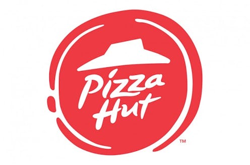
November 19-Beyond

And here's where the journey ends ... for now. Pizza Hut has lived many lives, but with each one it sheds a new and improved pizza haven is reborn. This new logo, with its simple yet regal feel is the perfect symbol of how far Pizza Hut has come. Plus, it kind of looks like a pizza, so there's that too.
Images: Logopedia/Pizza Hut
