Life
This World Chess Championship Logo Looks Ridiculously NSFW & People Have QUESTIONS
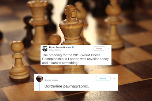
Who doesn’t get extremely horny at the mere mention of “chess”? Most people? Well, maybe you’ll second guess that after you feast your eyes on the World Chess Championship logo, which looks pretty kinky. Created by Moscow-based agency Shuka Design, the logo for London’s 2018 World Chess Championship features an apparently intentional, surprisingly sexual image of two figures playing chess with their legs intertwined. (Bustle has reached out to both World Chess and Shuka and neither immediately responded to requests for comment.)
Lest you think the design a sexy accident, the event’s website calls the branding “controversial and trendy, just like the host city." I don’t know that “controversial and trendy” are the first words that come to mind when I think of London or cross-legged intercourse, but on second thought, sure why not.
World Chess also stated in their announcement that they were “very happy to unveil” Shuka Design’s creation, just in case there was question of whether chess players were straight-up freaks. They are and they want us all to know it. World Chess is also selling limited edition prints of the self-proclaimed “sexy” logo if you still have someone left on our holiday shopping list that likes chess and having sex and maybe even both at the same time.
You may have assumed chess to be the most sexually repressed of the classic board games. (Additionally, Candy Land is very sexually liberated and Monopoly is horny but relatively reserved.) However, as the World Chess Championship implies, chess is, in fact, ~*supremely sexual*~.
Did you know there is a thing in chess called “castling”? Look me in the eyes and tell me that doesn’t sound like a sex thing. The phrase “checkmate” is certainly a thing people have said during foreplay. “Grandmaster” is the highest title a chess player can achieve and subsequently evokes strong BDSM vibes. And don’t you dare try to deny that, at some point in your life, you’ve looked at a bishop piece and thought, “That’s kind of penis-y.” If I have to tell you what a pawn looks like, you aren’t old enough to be reading this. (Just kidding, I don’t know what it looks like...but now chess pieces all look vaguely sexual to me.)
However, the logo has left some feeling less than gratified. Australian chess Grandmaster David Smerdon tweeted about the logo using the hashtag #YouHadOneJob. Susan Polgar, an American Grandmaster and a pioneer of women’s chess, thought the logo was particularly inappropriate for an otherwise family-friendly game. “I strongly urge @theworldchess @FIDE_chess to scrap these logos and come up with something else which is classy, attractive, clever, marketable” Polgar tweeted, “and most importantly something the entire global chess community can be proud of!”
A few are more bothered by the technical flaw in the design, according to the Telegraph: the chess board depicted shows only 6x6 squares. Chess require an 8x8 board. Perhaps no one caught the error on account of the giant, unavoidable sex happening at the forefront of the design.
The world is more than familiar with sexy logos, accidental and less-so. A simple Google search will lead you down a rabbithole of unintentionally inappropriate logos filled accidental nudity galore. Last year, Trump and Pence’s campaign logo at the two appearing...extremely close.
If the Kama Sutra-inspired design is too kinky for your taste, the ad campaign also includes another logo for the Word Chess Championship. While equally weird, featuring a design of disembodied arms playing chess, it’s decidedly less sexual.
Still, that initial logo is kind of hard to unsee. It’s probably safe to say that none of us will ever be able to look at chess the same way again.
