Life
Why Is The Election Map Red And Blue?
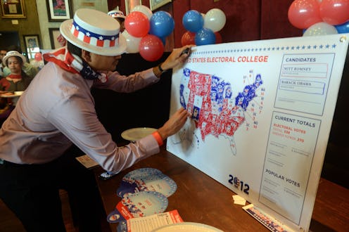
Come the evening of Nov. 8, every news outlet in America will broadcast the same map as it is divided into red and blue states. As the votes pour in, these primary colors will slowly reveal our next president — but have you ever stopped to wonder why the election map is red and blue in the first place? Many of us rarely give these color categories a second thought — perhaps assuming that Republicans have always been associated with red, and Democrats have always been blue. In a new video released just before America hits the polls, thoug, the ever-knowledgeable YouTube channel Today I Found Out explains exactly how this primary color dichotomy came about.
While the symbolic colors red and blue have been popular in politics for quite some time, their meaning has varied over the years. As host Daven Hisky explains, in the early part of the 20th century, the colors were actually the opposite of how we think of them as today, with Liberals more likely to be associated with red and Conservatives closely aligned with blue. Hisky points to the periods of 1918 to 1921 and 1947 to 1957 known as the first and second "red scares": During these times, many feared the rise of Communism and the radical left. However, during the Cold War neither party wanted to be associated with Communism in any way, and the color red fell entirely out of favor. In electoral maps made during this time, it is said that each party made the opposing party "red."
The first time the color red was given to a party by a major media outlet was during the presidential election of 1976. TIME Magazine published a map where the states won by Democratic incumbent Jimmy Carter were colored red, and those won by Republican President Gerald Ford were white. TIME switched the colors again in the following election, making states won by then Democratic President Carter white. This choice was not so much party motivated, Hisky points out. Instead, TIME chose the more vibrant color to symbolize the winner of the election. During the 1980 election season, an NBC broadcast showed an electoral map where states won by Republican Ronald Reagan were blue, and those won by the Democrat were red. NBC maintained these party colors for the next 20 years, though other networks did not follow suit, and there was no official media consensus.
The 2000 election between Republican George W. Bush and Democrat Al Gore cemented the color categories we use today. The country was split evenly between the two candidates in the weeks leading up to the election, and the tense polls dominated the news. NBC chose to use blue to represent states won by Gore and red for those won by Bush, and the rest of the media adopted that form. Hisky notes that this is in opposition to how other countries identify Liberals and Conservatives. (But then again, America has no problem with going against the grain. We don't even use the metric system.)
While nobody is certain when the terms "red state" and "blue state" first entered the colloquial vocabulary, rumor has it they were coined by Tim Russert of Meet The Press during an October broadcast in 2000. By the time the heated Supreme Court case was decided, and Bush was finally elected president, the idea of red and blue states were seared into the American public's memory. Today is seen as an error if anyone in the media reverses the colors — though they have only really been "official" for four presidential elections.
Check out the entire video above for the complete history of our red and blue map, and be sure to vote next Tuesday!
Images: TodayIFoundOut/YouTube, Giphy
