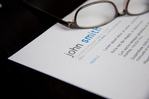
There's no denying how important a well-written resume is when you're on the hunt for a new job—but have you ever stopped to wonder what font you should use on your resume? Bloomberg recently asked a handful of “typography wonks” — experts, basically, but with a much more entertaining title — what the best and worst fonts to use on your resume are. The results? Are… surprising. I mean, they're not super surprising — you should be able to name at least three right off the bat that should never go anywhere near your professional CV — but there are still some unexpected items on the list.
The top three? Helvetica, Proxima Nova, and Garamond. According to Brian Hoff, creative director of Brian Hoff Design, Helvetica is “so no-fuss, it doesn't really lean in one direction or another”; he also described it as “professional, lighthearted, [and] honest.” Proxima Nova, meanwhile, is similar to Helvetica, albeit with “a softer feel.” Said Hoff to Bloomberg, “I never met a client that didn't like that typeface” — as long as you're willing to pay for it: The entire set with run you upwards of $700.
And as for Garamond? Apparently it's a good choice for those with lots of experience; it's useful for trying to fit a lot of stuff on one page. Said Matt Luckhurst, San Francisco-based brand consultancy Collins' creative director, to Bloomberg, “Garamond is legible and easy for the eye to follow. [It] has all these quirks in it, so what that does is allow the eye to see where it should go.”
Surprisingly, though, Times New Roman isn't very well regarded — which has suddenly thrown me into a tailspin. What? You mean the font that literally every single teacher I have ever had instructed us to use — from middle school all the way up through graduate school — is wrong? Apparently, yes. Said Hoff, “It's telegraphing that you didn't put any thought into the typeface that you selected. It's like putting on sweatpants.” Now if you'll excuse me, I have to go pick up the tattered remains of my life, because it appears that everything I have ever known is a lie.
While I'm recovering from that unexpected blow to my default font, though, let's take a look at a few other fonts one should never, ever use on a resume. Here are the ones at the top of my own DO NOT USE list; what's on yours?
1. Courier

According to Luckhurst, the only people who should be using anything that looks vaguely like Courier are the ones who are still using actual typewriters.
2. Papyrus

I will confess to having had an inexplicable love of Papyrus once upon a time — but only for things like AIM. No way would I ever think of turning in a paper for school (or for work, or for anything else important) in Papyrus.
3. Wingdings

How the heck is the HR person supposed to read it?
4. Impact

The only impact a resume submitted in this font will make is the deafening thud that will ring out as it hits the “rejected” pile.
5. The Breaking Bad Font
Although I kind of dig that a fan-made version of the Breaking Bad font exists — it's called Heart Breaking Bad, and you can download it here — submitting a resume featuring it will probably send the wrong message. Yes, even for STEM jobs. Juuuuuust sayin'.
6. Lucida Handwriting

Luckhurst actually used the following soundbyte when discussing Courier, but I think it's also applicable here: “You have been using a computer to do a handwritten thing. You haven't used a computer properly, and you haven't handwritten properly.” Basically, it means you've failed at everything. Noted.
7. Comic Sans

No. Just no. No, not even the revised, “grown up” version.
8. Emoji
Unless you're applying for a job at the Unicode Consortium or something — in which case I would still recommend having a resume written in words on hand, as well as one written in emoji. Hey, maybe you can use the fruits of the Emoji Translation Project's labors!
Images: flazingo_photos/Flickr; Lucia Peters (6); Giphy (3)
