News
Here's What The PyeongChang Olympic Logo Means, Because It's Super Symbolic
With the winter Olympics now underway, the world is watching its athletes compete in this quadrennial celebration of snow- and ice-filled sport. And given its ubiquitous presence, it's hard to miss the Olympic logo designed for this 2018 edition of the international sporting competition. So, many viewers may be wondering: just what does the PyeongChang Olympic logo mean?
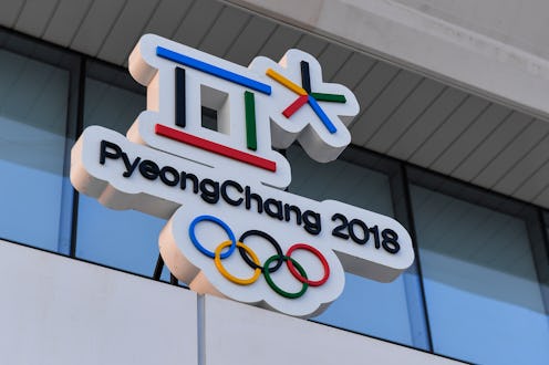
In short, the logo "symbolizes a world open to everyone," according to the PyeongChang 2018 official website. It's a message achieved through layering the symbols with multiple meanings.
The emblem design combines elements of Hangul (the Korean alphabet) and Cheon-ji-in (Korea's traditional humanism). According to the Olympics' official website, the logo's formation stems "from the first consonants of each syllable in the word 'PyeongChang' when it is written in Hangul." The emblem's first character functions in another role too, representing "a gathering place where the three elements of Cheon-ji-in – heaven, earth, and human – are in harmony."
The second character "symbolizes snow and ice, as well as the athletes’ stellar performances." Additionally, the logo employs "five traditional Korean colors – black, blue/green, yellow, red, and white." They correspond with the colors found in the Olympic flag as well.
At the 2013 emblem unveiling ceremony, Olympic Commission Chair Gunilla Lindberg said, "This new emblem truly reflects those values and PyeongChang and Korea’s commitment to staging truly outstanding Games that will create new horizons for winter sport and the Olympic Movement in Korea and across Asia."
Though it may not be common knowledge, the Olympic logo is actually quite a big deal in the design world. Take the (apparently) highly controversial design chosen to represent the 2012 Olympics in London. It doesn't immediately convey much about London, the Olympics, or even athletes in general. And the logo earned itself a lot of disgruntled commentary as a result.
The London Olympics logo hate went beyond rejecting just its aesthetics. The secretary general of Iran's National Olympic Committee, Bahram Afsharzadeh, actually threatened at one point to have his country abstain from the games. Afsharzadeh claimed that he could see the word "Zion" spelled within the design. (Iran and Israel have been longtime foes.) Other commenters suggested the design looked like Lisa Simpson involved in very definitely adult behavior.
Company Folders called the London logo guilty of both "controversy and tragedy." The logo was not without its defenders, though. Legendary designer Milton Glaser gave it 80 points out of a 100, writing that "because of its aggression, it persists in memory." In fact, Glaser put together a ranking of all Olympic logos to date, and even included some revealed emblems for future games. His top pick of all time (score: 90) was the vintage-themed logo for the 2004 Olympics in Athens.
The worst-ranked logo? According to Glaser, that would be 1932's disaster creation for the Los Angeles Olympics. He sums up its various design fails this way: "A visual disaster; combining the rings, a laurel leaf and the American shield in an overlapping pattern is impossible. The typography goes on its own unrelated way."

The most recent logo controversy involves accusations of plagiarism that led to Japan withdrawing its original pick for Tokyo's 2020 games. The designer behind the allegedly pilfered creation, Kenjiro Sano, has denied that he stole his idea from Belgian designer Olivier Delbie. But when subsequent Sano works were discovered to have lifted from other designers, with no credit given, Tokyo pulled his logo.
While the PyeongChang Olympics emblem has been met with mixed reviews (Glaser score: 60), it's been thus far free from the scandal ignited by London's 2012 and Tokyo's 2020 designs.
