Life
Here's Why Twitter Looks A Little Different Today

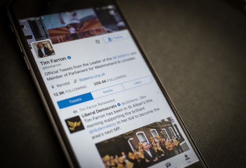
If you’re wondering why your Twitter looks a little different, it’s because the social media app got a little update. On Thursday, Twitter started rolling out its new look on its desktop site, which features tweaks to functionality and updates to the app's look and feel. Twitter says the redesign — their biggest in years — is part of an attempt to streamline usability, according to Wired. The company's heard through user surveys how the clunky interface can be confusing to some users, and the fresh look is as much an aesthetic refresh as it is an attempt to improve user experience. And while feedback has been mostly positive, the new Twitter looks a bit different than what die-hard users are used to.
So what’s on tap for the new Twitter? For starters, users can expect a handful of subtle, organizational changes. Users will notice a new side navigation menu, designed to make managing multiple accounts and keeping a pulse on what's happening in the thread even easier. Peek through the menu and you’ll find access to your profile, any other additional accounts you’re authorized to use, your settings, and your personal privacy features all in one place. Aggregating everything on the sidebar alleviates the need for more tabs at the bottom, reduces clutter, and generally just makes everything a bit easier to manage. The new layout might feel familiar to Android users, as it mimics the layout presented on the android app.
Other shortcuts include opening websites opening automatically in Safari. The improvement saves iOs users time by allowing them to view content on sites they’ve previously logged into, and set this as a default function.
The app's visuals got a makeover, too. Aesthetically, Twitter swapped its previous look for something a bit more refined. The type feels a little softer, as do profile photos, which are now presented as circles. Many of the icons got a revamp, too. Stylistic updates make certain icons feel more intuitive (note the new retweet symbol) and fine, pencil-drawn styling offers a cleaner look. Also exciting is the new retweet count, which ticks up in real time.
The redesign comes at a time when Twitter's purpose — previously nebulous, limited, and a little irrelevant — seems clearer and more useful than ever. Updating the app is just one more step to a more purposeful, news-oriented Twitter, and the tweaks, though subtle, make for a more pleasant user experience overall.