Life
The Story Behind The Sisters Uncut Logo Is A Lesson In British Feminist History

Ever wondered about the origins of Extinction Rebellion’s logo or how the Pussyhat became synonymous with the Women’s March overnight? Consider this your starting point. First and foremost, protest is about people taking to the streets and mobilising against injustice – but the art, logos and objects that come to represent these uprisings are often striking. Through six historic objects – from the ‘Dike - Just Do It’ Pride T-shirt to the NAMES AIDS memorial quilt – Bustle looks at the origins and significance of protest design.
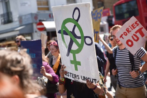
Sisters Uncut, the activist group that opposes cuts to domestic violence services in the UK, was founded in 2014. Best known for staging direct action protests in public places – dyeing the fountains of Trafalgar Square red in 2015, storming the VIP opening of the new Tate Modern extension, and infiltrating the premiere of the film Suffragette – the feminist group first formed in response to the 2010-15 Coalition Government polices which threatened to impact survivors of domestic and sexual violence. Their main concern? That without properly funded services and support, women and non-binary people would be left unable to escape their abusers. As one of their protest banners asks: How can she leave if she has nowhere to go? But where did Sisters Uncut's logo come from and what does it mean?
Where did the Sisters Uncut logo come from?
The group’s logo borrows from the language of traffic signs: ‘No Cuts’ is communicated visually inside the venus gender symbol. It also references the Suffragette’s colour-scheme: purple, green and white.
“Referencing past movements emboldens others,” explains Corinna Gardner, curator of the V&A’s Rapid Response collection. “It needs to be carefully and sensitively done. Sisters Uncut are using a set of colours and an identity which was conceived a century earlier. Certainly those who are interested in some of the causes where Sisters Uncut act will be familiar with the suffragette movement, and the development of that colour-scheme, and some of the insignia used by people like Sylvia Pankhurst,” she says.
When Pankhurst began attending Women's Social and Political Union (WSPU) meetings with her mother, fellow activist Emmeline Pankhurst, she quickly began putting her training as an artist to good use, designing insignia and decorating their meeting halls. And in 1908, the WSPU – commonly known as The Suffragettes – adopted a purple, green and white colour-scheme, chosen by another campaigner Emmeline Pethick-Lawrence. "Purple...stands for the royal blood that flows in the veins of every suffragette...white stands for purity in private and public life...green is the colour of hope and the emblem of spring," she wrote in Votes for Women, the WSPU’s newspaper.
“Clearly, renewed interest in the centenary of women being able to vote has brought that design of 100 years back into circulation," Gardner says. "And hence Sisters Uncut feel it's meaningful to build on that established sense of political meaning and conviction.”
Is this a common feature of protest design in general?
“That visual reference point for something familiar from the past, with a similar intent or purpose is absolutely a regular practice within design and creative communities,” says Gardner. “If you look at the Pussy Hat as an example of craft as activism, that has its precedence in the recent and more distant past. We have a T-shirt which does something similar in the Rapid Response collection. It takes Nike’s ‘Just Do It’ and says ‘Just Do Her’. It’s a question of copying and bootlegging.”
A century on from the fight for women’s suffrage, Sisters Uncut continue advocating for women and non-binary people in the face of austerity and significant cuts to services. The cause may have shifted from the suffrage movement, but ultimately, Sisters Uncut are still focused on giving marginalised people a political voice – and their work is crucial.
This article was originally published on